
Vännäs graphic profile
Here you will find guidelines for the graphic communication around the Vännäs brand.
- Origin and meaning of the logo
-
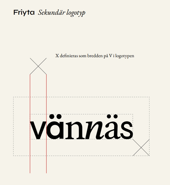
The logo is the most important carrier of our visual identity and should therefore be included in all communication. The logo is available in two variants: the primary logo with the subtitle "the best thing about Västerbotten", and the secondary logo without subtitles.
The logo is a word image made up of six different fonts, all of which contribute with their temperament, expression and emotions. The mix of characters, characteristics and styles is a visual reference to the brand platform where, among other things, co-creation is prominent for the brand. Our brand promise "With steady speed and faith in the future" is expressed in the logo, among other things, through the italic n, which creates a forward movement in the last half of the word image.
- Logo clearance & minimum size
-
Free space
In order for the logo to always be visible and to have the space it needs, it is important to respect the established free space. The free area (X) is defined as the width of the initial letter V in the word image. Within this space, no other
objects, logos, or text are placed.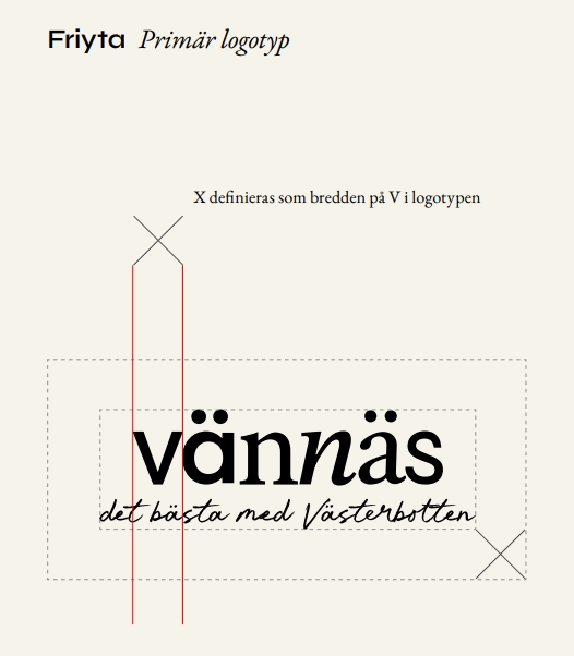
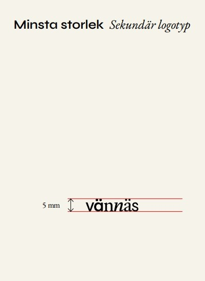
Minimum size
To ensure sufficient recognition and legibility of the logo, there is a defined minimum size. The logo must never be used in a smaller size than this specified value.
For the primary logo, 15mm in height applies as the minimum size. For the secondary logo, 5mm in height applies as the minimum size.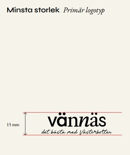
- Typography
-
In our visual identity, typography has an important role. For headings and large texts, we use the font Syne in the weight Semibold. Syne Semibold is a modern, characteristic font that takes on and contributes a lot of identity to our communication.
And we use EB Garamond for all texts except headlines or short messages where Syne Semibold takes over with his unique character. EB Garamond is a modern interpretation of one of history's most classic and appreciated fonts, Garamond. This new interpretation is adapted for modern use with a focus on digital readability. EB Garamond is designed to work great even in smaller screen sizes.
Both Syne and EB Garamond are fonts from Google Fonts, which means that it is open for anyone to download and use.
Download font:
- Colors
-
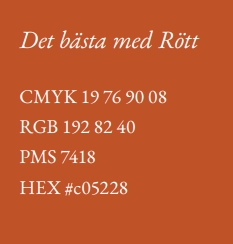
In our visual identity, our colour The Best with Red is in focus. The colour red is an important identity bearer that conveys the warm, familiar and embraced feeling that is an important part of our brand. We use our red colour as a background for both large surfaces and smaller elements.
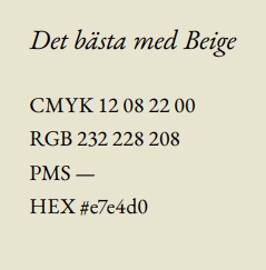
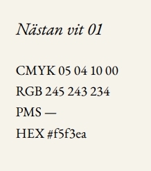
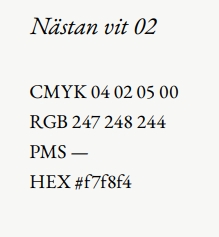
Our secondary colours The best of Beige and Almost White 01 & 02 we use as a support for our main red colour. These colors are all warm and neutral shades that are primarily used to create warmth on otherwise completely white surfaces. With our three light shades, we have the ability to customize backgrounds and other surfaces depending on the context and circumstances.
Color codes:
- Imagery
-
Proximity, community, co-creation, movement and faith in the future are the foundation of our brand platform and central to our imagery. With a strong, consistent and well-thought-out imagery, we use images and photography as an effective identity bearer in the communication of the place Vännäs.
Our photos are honest, sincere and warm. We get close and our imagery is documentary in its aesthetics. We avoid excessively saturated and colorful images, but instead tend to reduce the saturation and increase the contrasts slightly — all to convey an authentic, close and human feeling.
We use local models as much as possible, and we avoid rearranged situations.
We divide our images into three primary categories: Proximity, Belief in the future and Co-creation


